I saw this tag awhile ago at A Kernel of Nonsense and knew I had to participate- I love everything about book covers and design! I cheated on a couple, whoops…
Best Color Combo on a Book Cover
I love the ombre blue greens and the texture of This Adventure Ends! I know it’s paint but I always think it’s frosting. And I love how the orange looks against the teal on A Shadow Bright and Burning!


Best Typography/Font On The Cover
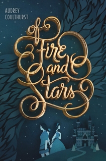
I love everything about the font on Of Fire and Stars– the swirls, the fact that it’s very readable WITH the swirls, the gold 3D effect. It’s gorgeous.
Best Simple Cover
Tarnish is my favorite cover of the trilogy- I love how shiny it is and how much the jewel stands out agains the textured background. It’s simple but so pretty!

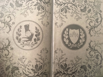
Best End Pages
This was a tricky one, I couldn’t think of many off the top of my head but I do love how intricate the Red Queen end pages are! They remind me of elaborate wallpaper.

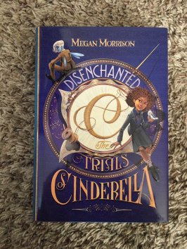
Best Map
I love maps, and there are SO many great maps to choose from! I chose Disenchanted: The Trials of Cinderella because I like how classic and neat the map is, and I love that we get a second, detailed map of the main city in the book as well!


Best Naked Hardback
The best thing about taking off a dust jacket is finding a surprise underneath! I adore the actual cover of First & Then, but I love the naked hardback just as much.

Best Back Cover
One thing I love about the front AND back cover of Since You’ve Been Gone is that they reflect actual scenes from the book! The back is so fun and I love that the list is printed right there to refer to.

I also love when a cover wraps around the front and back, like To All The Boys I’ve Loved Before! Charming all the way around 🙂

Best Chapter Headers
Unique and really fun- I love the chapter headers in Six of Crows (and Crooked Kingdom)!

Best Illustrations
I don’t have a lot of book with illustrations, and while I do like the new Harry Potter illustrated editions, they’re not my favorite. For me, nothing can top the art of Mary GrandPré and I adore every chapter illustration throughout the American editions of the Harry Potter series. It was always exciting to see what she would choose to illustrate and to figure out how it would apply to the chapter itself.

Best Spine
The Lunar Chronicles look so great lined up next to each other- I love the vertical titles and each icon at the bottom of the spines! And I love the colors too, the vibrant pop of red against the black.

Favorite Cover On Your Shelves
These are a few of them, I couldn’t pick just one…. I definitely have a type!


Do you love book covers as much as I do? What’s your favorite special part of a book (besides the story of course)? I’m tagging anyone who would like to participate!

You do have a type! You really like people on your covers, with big, bold titles 🙂
I cannot agree with you more about your color combo choices. I love when the cover art feels *alive*. Wrap around covers are great too — it makes me want to pin them up like posters haha.
LikeLike
Yes! I love wrap around covers and beautiful colors. So striking 🙂
LikeLike
Yay, I’m so glad you do this one! I love the font for Of Fire and Stars, it’s so lovely. We don’t get very many books these days with endpapers. I struggled to find a fitting one as well. I love when the cover photo wraps around too. And when there’s a surprise under the dust jacket? I get so excited! Loved seeing all the beautiful covers you picked for this one.
LikeLike
It really is! I forgot about Fairest (because I didn’t love that book) but it does have nice endpapers. I wish books had more! Ohh yes, I love surprises! Aww thanks.
LikeLiked by 1 person
This Adventure Ends is one of the best covers of the last few years I think. It’s so good. I love ASBaB cover — have you seen the sequel? It’s purple-y!
[shakes fist at OFaS] Such a pretty cover, such a boring book.
I also love that cover of Tarnish. This reminds me I also need to read the last book in that series.
I LOVE FANTASY MAPS SO MUCH. I also haaate that the book crease ruins like 24% of a good map. Dani once found a map that FOLDED OUT and I was like THIS IS GENIUS WHY DOESN’T EVERY BOOK DO THIS and THAT is the kind of map we need.
ANYWAY. This is also a good map. Is it weird that a map is more likely to make me read a book?
I love how the Lunar Chronicles look lined up. I also love when spines of a series make an image – like HP with Hogwarts on the special edition or that the Fall of the Roman Empire’s spines show a decaying Roman pillar. Awesome.
I have this post in the future. I guess I need to go find some end papers and chapter headers.. 😉
LikeLike
I agree! It really does make me think of frosting, which I love. Yes I love the purple and that it looks nice with the first book!!
Yepppppp *side eye*. I just started Brazen recently! Omg fold out maps, that sounds so revolutionary but like it should be normal?!
I LOVE the new Hogwarts spines! So cool!! Even the Percy Jackson ones even though I haven’t read that series haha.
LikeLike